The Sainsbury Archive collection charts the history of Sainsbury’s from its foundation in Drury Lane in 1869 to now. It provides a unique record of the transformation that has occurred in retailing since the mid-19th century, and the impact of these changes on society.
The collection includes all the items you would expect in a business archive - key company records such as reports and accounts, press releases, head office operations, food supply, etc; however, it is particularly strong in the areas of product packaging and it is this series of records that I will be writing about here.
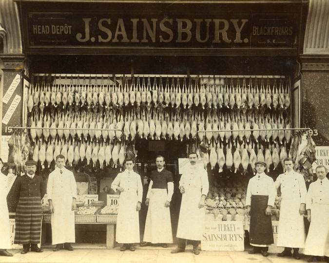
Undoubtedly my highlight of the collection, the packaging material spans the company’s 150 year history, with the earliest example of packaging reflecting the limited range of products available when they first opened. The first shop only sold three items – eggs, milk and butter – but rapidly expanded to include other grocery items.
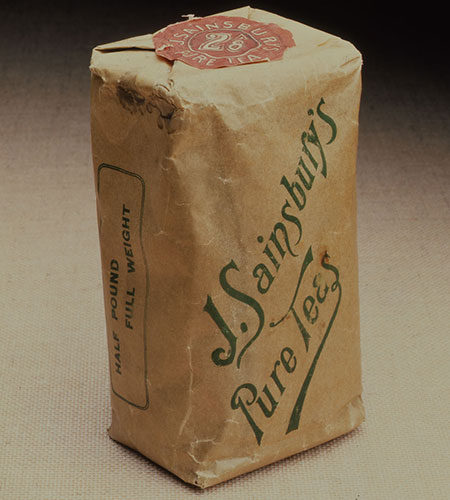
J. Sainsbury's Pure Teas packet
c.1903
When groceries were first introduced in 1903, packaging remained simple. Tea packets were made of paper with a foil lining and different coloured seals to denote different blends. Sugar was sold in thick blue paper bags, made by salesmen during quiet moments. Flour was sold in reusable cotton bags. Butter, cheese or sausages would be wrapped in greaseproof and brown paper and tied with string. Customers would bring their own jugs for milk (and sometimes their own dishes for butter). Eggs were sold loose in wicker baskets and carried home in paper bags.
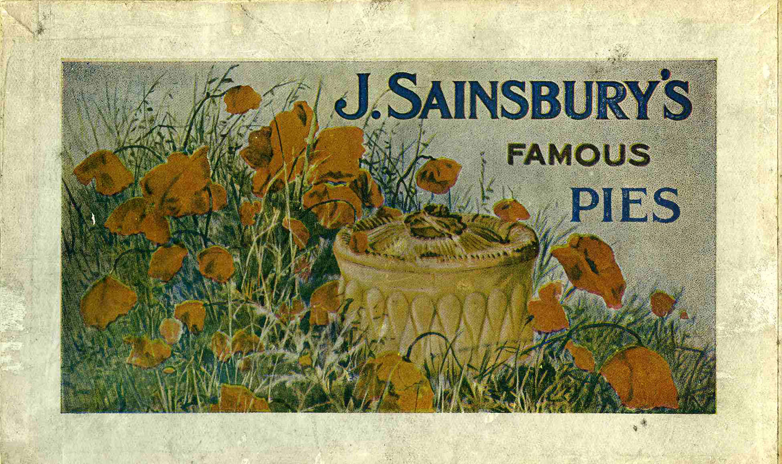
Packaging for pies and cooked meats was more elaborate. An order of half a pound or more of York ham would be placed in a white box with green edging and tied with a green ribbon. ‘Hand-raised’ pork pies came in boxes with designs of poppies and corn on the lid.
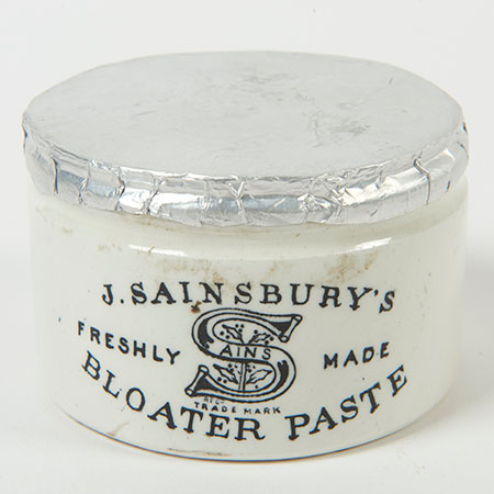
J. Sainsbury's freshly made bloater paste jar
c. 1920-40
Bloater paste (I’m assured it tasted better than it sounds), potted meats and jams came in earthenware jars, featuring the Sains-berry design. This pun – an S with a pattern of holly berries - was the company’s registered trademark between 1909 and 1951.
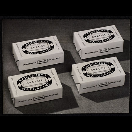
Sainsbury's Crelos margarine
c. 1954
During the 1930s and 40s several brand names were introduced for Sainsbury’s own products. ‘Selsa’ was the brand name for a wide range of grocery goods, while ‘Crelos’ was used for margarine and ‘Basket Brand’ for tinned fruits.
Sainsbury's early grocery packaging used various elaborate and colourful designs, but common styles and colours can be seen on some labels. By the 1940s, the importance of design to unify the company image was recognised but it was the transition from counter service, where goods were individually weighed and wrapped, to self-service, where customers took items off shelves themselves, that prompted a revolution in packaging design.
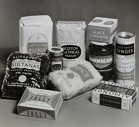
Sainsbury's 1950s packets
By the end of rationing in 1954, most foods required some kind of packaging. Many factors had to be taken into account for the design for this new style of shopping. The package had to protect its contents and withstand handling by customers. It had to be clearly labelled and identifiable from any angle. It also had to be easy to stack and to look attractive both on its own and in displays.
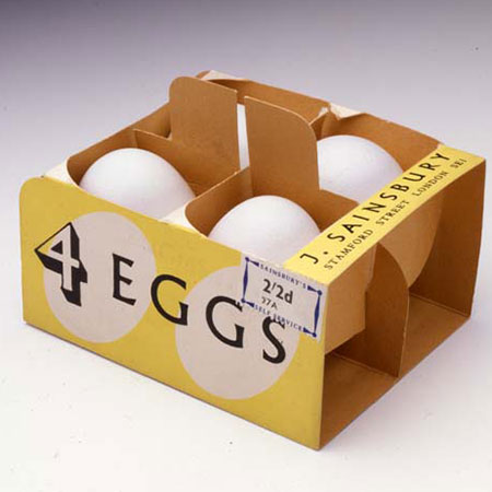
Sainsbury's box of 4 eggs
1953
Sainsbury’s appointed Leonard Beaumont as the company's first design consultant in 1950 and he created simple, consistent designs which reflected the company's reputation for quality and cleanliness. He used only one typeface (Albertus), stylised graphics and muted colours to create a clean fresh image which echoed the design of the self-service shops. For example, eggs had traditionally been sold loose. When they came off ration in 1953 a new 4-egg pack was introduced. However, I’m sure the flaws with this design are obvious, and it was swiftly replaced with a sturdier box.
The development of self-service stores provided an opportunity for Sainsbury's to expand and modernise their range of packaged products. The names 'Crelos' and 'Selsa' were discontinued during the war. New products were clearly branded with the Sainsbury name. Canned goods were important in the years before frozen food and during the 1950s Sainsbury's increased its range of canned fruit and vegetables along with tinned meats.
It was the drive to sell more own label produce that let to Sainsbury’s setting up its own in-house Design Studio in 1962, led by Peter Dixon. He took Sainsbury's corporate image to a new level, using bold colours and patterns to create an influential 'pop art' style. Dixon, and his small team of five designers, were charged with the job of designing packaging for every item of Sainsbury’s ‘Own Label’ brand. This was no mean feat, as during the 60s over 1,000 new Sainsbury own brand products were introduced and by the end of the sixties own brand lines accounted for over 50 per cent of Sainsbury's turnover.
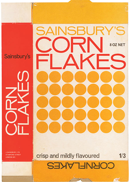
Sainsbury's Corn Flakes packaging
1970
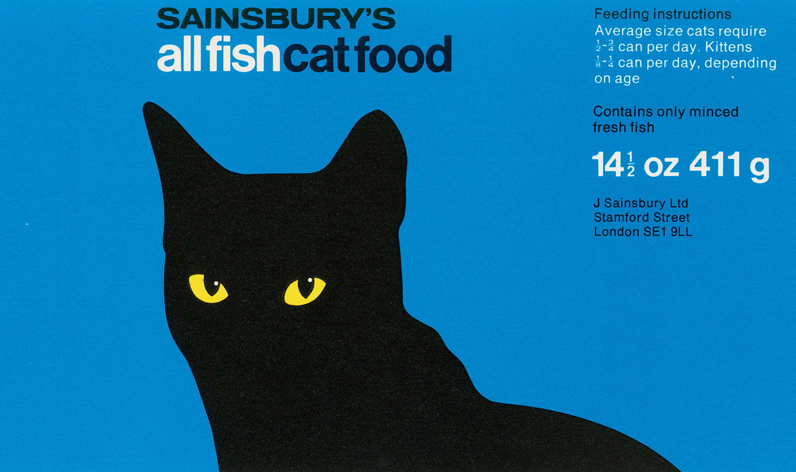
It was considered important to convey the 'unobtrusive good value' of the Sainsbury brand. Dixon created restrained graphics which often made use of stylised, geometric illustrations. There were few restrictions imposed on the design team. The one thing Dixon does remember is that "the company logo had to be prominent and later on we had to set it in Venus Bold Extended". Aside from this he had “three colours of your choice to play with and as many typefaces as you wanted to use”, however despite the freedom of choice, the designs of Sainsbury’s Own Label packaging tended to be simple and uncomplicated. Design magazine described them as 'austere and even Bauhaus'. At the time Dixon said "I wasn't even aware of the Bauhaus until it was used in the article, then I pursued it, found out who they were and what they were producing. I took it as a compliment."
The company director at the time, John Davan Sainsbury personally approved every design, in a weekly Monday morning meeting. Eventually the design standard was rolled out company wide and included building design, shop front lettering, store layout and advertising
The appeal of this design style lives on, and while the in-house design studio was wound down during the 90s and the job of packing design outsourced, in 2019 as part of the company’s 150th birthday celebrations, these designs were used on a series of carrier bags – the archive, of course, has a complete set.

