


Lead Curator Alex Werner explains what prompted Charles Booth to self-fund the survey on which the map is based — which allows the onlooker to understand ‘very quickly’, where the wealthy and poor people of London lived.
Charles Booth's poverty maps are colour-coded maps of Victorian London. They were funded by Booth — a Liverpool ship owner, who came down to London — and are based on a survey of the population between 1886 and 1903.
Booth inherited and greatly expanded his father’s shipping business, diversifying into trading skins and leather and opening steamship services to Brazil.
In 1885 Booth became angry about the claim made by H.H. Hyndman, the leader of the Social Democratic Federation, that 25% of the population of London lived in abject poverty. Bored with running his successful business, Booth decided to investigate the incidence of pauperism in the East End of the city. He worked with a team of investigators to assess pauperism in the East End, publishing Life and Labour of the People in 1889 and its successor, covering the rest of London, in 1891.
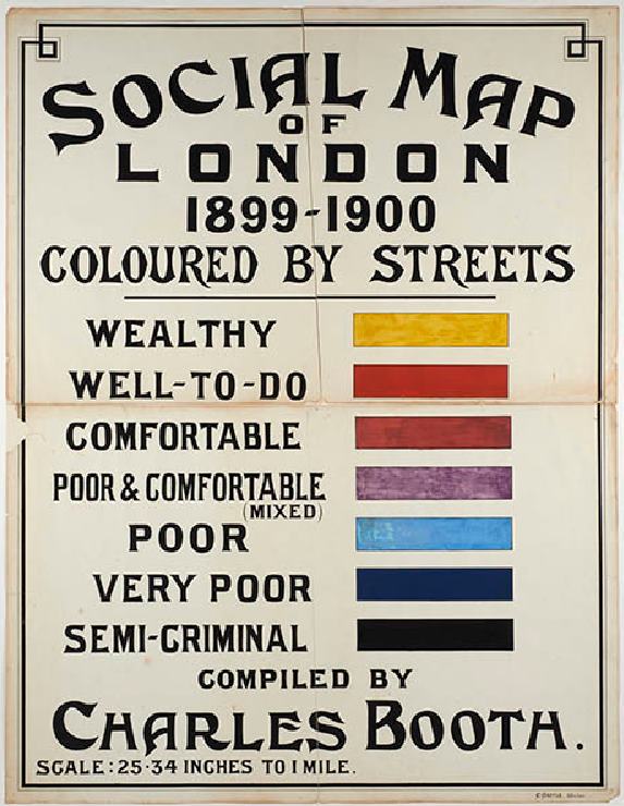
The Booth Map key (ID no.: 27.120/2)
The most famous product of this survey were Booth’s poverty maps. The maps identified the social character of every street in London through colour coding. The one in the museum’s collection was based on research carried out between 1886 and 1889. An updated map was created in 1898–99.
Seven different colours are used to identify eight different classes of society. A street coloured black represented the lowest class, vicious and semi-criminal; dark blue the very poor and casual labourers in chronic want; light blue the “poor” with an income of 18s to 21s a week for a moderate family. A purple street was one with a mixed social class — with some comfortable and others poor. A pink street was “fairly comfortable” with good ordinary earnings, a red street middle class and “well-to-do”, whilst a yellow or gold street housed mainly upper-middle and upper class, wealthy families.
It began as four large sections but was cut into 60 sections in the 1970s covering different parts of the city.
The Museum of London holds the original map (1886–89) in its collection. And in this video, Lead Curator, New Museum, Alex Werner explains how the map shows — in a snapshot — the contrast between wealth and poverty in Victorian London, just like today!
You can also read more about Charles Booth here.
Header image: Section 36 of the original Descriptive Map of London Poverty, compiled and hand coloured by Charles Booth and assistants in 1889. (ID no.: 27.120/1aj)