


In this section


London under the microscope
This data visualisation reimagines London’s geography through the iconic structure of the COVID-19 virus, to demonstrate and sonify how the first year of the pandemic transformed the city.
How did the COVID-19 pandemic impact UK’s capital city and its residents? ‘London Under the Microscope’ uses data to creatively illustrate how the city changed over the first year of the pandemic and how that affected Londoners. It was commissioned by the Museum of London in 2021 as part of our Collecting COVID project.
The visualisation — using different sources of data in a very comprehensive and visual way in 365 seconds — starts on 1 March 2020 and ends on 28 February 2021, with one second of the video representing each day. The artwork reimagines the geography of the city using the now-iconic shape of the COVID-19 virus. The artist Valentina D'Efilippo was struck by the way that 3D images of the COVID-19 virus have become widely familiar, giving an invisible disease a visual identity. The artwork combines visualisations with sonification, i.e., presentation of data as sound, as interpreted by Duncan Geere from Loud Numbers. The data was coded by Arpad Ray.
Elements of the visualisation include the use of distinctive “spikes” of the coronavirus to represent the London boroughs. In the video, the spikes lengthen with the passing of time and a new disc appears every day scaled to accurately represent the number of reported cases that day.
The artwork follows the daily deaths on London — illustrating the numbers with spheres that emerge from the virus spikes. The cumulative number of deaths in the city are tracked via a grey screen starting at the bottom, which progresses to fill up the screen and dramatically change the scene.
On the surface of the virus, subtle motion graphics like curved lines, mark the mobility in each local authority area of London, as indicated by the use of public transport. This draws from Google Mobility data reports. We see the city opening up during the summer of 2020, with more particles moving in the visualisation. Over time, a deep red transforms the virus’ surface to illustrate the death toll and how some areas have been more affected than others. The different shades reflect the deaths, per 100,000 of the population.
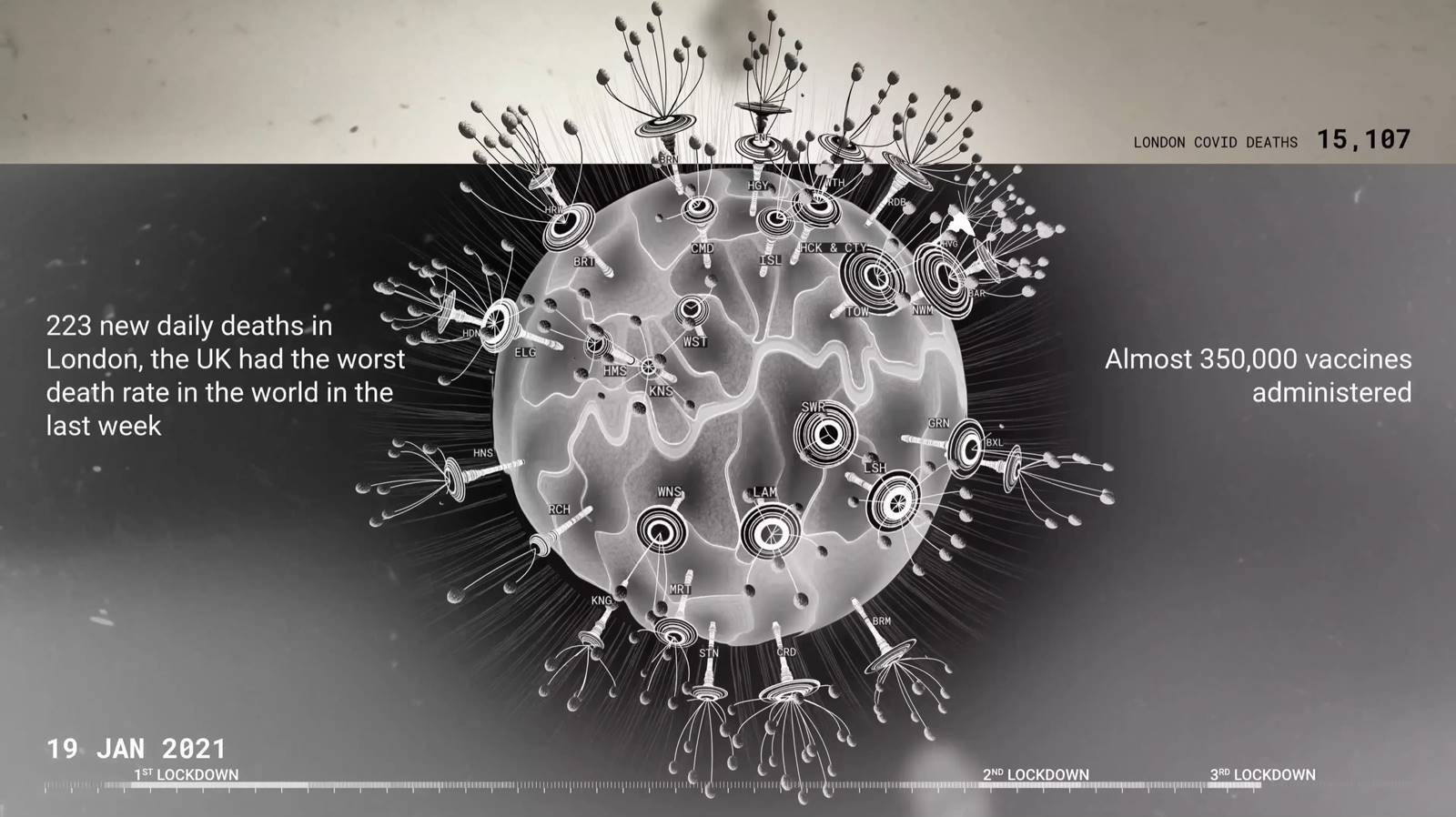
As the first COVID-19 vaccines are introduced in December 2020, the visualisation shows filaments growing from the virus, with one line representing 100 vaccinations. The lines build up into a halo effect, which intends to lend the image a hopeful appearance.
This digital artwork aims to provide a framework that can help viewers reflect on their lived experience of the COVID-19 pandemic in London. Its creators see data “as a lens to understand the past and a conversation starter to anticipate the future”.
‘London Under the Microscope’ complements a series of data visualisations in the museum’s London collection that unveil hidden and untold narratives about the city, and was commissioned for Museum of London’s Collecting COVID project, which documented the experiences of Londoners during the COVID-19 pandemic.
The data visualisation was commissioned by the Museum of London and supported using public funding by Arts Council England.
Also of interest
-

Why are we #CollectingCOVID?
In April 2020, the museum launched its rapid response collecting programme to document the COVID-19 pandemic in London
-
Loss and bereavement during COVID-19
Six illustrations attempt to record the experience of losing a loved one during the COVID-19 pandemic.
-
Inner rooms, inner minds
How can London’s mental health crisis — intensified by COVID-19 — be documented and collected through social art practice?